Compelling and Moving – A Guide to Motion Design Principles
Motion has a profound impact on the user experience of digital products, but if interface elements don’t exhibit basic motion design principles, usability is undermined. In the context of user interfaces, motion is more than a visual garnish. It is a compelling force that bolsters product engagement and extends the reach of design communication.
Our world is one of movement. Even in still moments, leaves tremble and lungs expand. In the realm of digital product design, it would seem that motion is second nature, an extension of the everyday to be leveraged with little effort. If only that were true.
Just ask anyone who’s animated UI elements for the first time. Hours of effort yield amateur results. Something as simple as a card sliding onto the screen looks awkward. Why is that?
In theory, making UI elements move is easy. Define points on a predetermined path, and software tweens the gaps. In reality, it doesn’t work that way. Tools and techniques are essential, but they derive their power from principles. If motion is to enhance the usability of digital products, it must be founded on unchanging rules of behavior that apply to an infinite number of use cases.
The Origins of Motion Design
The marriage of motion design and UX is relatively new, but its roots are in Disney. Frank Thomas and Ollie Johnston were among Walt Disney’s most valued animators and key contributors to classics like Pinnochio, Bambi, and Fantasia. Their 12 Basic Principles of Animation remain influential in motion graphics for film, television, and digital content.
The Disney principles distill the essential laws of physical motion for the sake of animated storytelling. They empower drawn characters to move and emote, but they don’t adequately address the interactive motion needs of modern user interfaces.
Contemporary designers have attempted to bridge this gap. One of the more illustrative examples is the 10 Principles of Motion Design, a Disney adaptation by animation expert Jorge R. Canedo Estrada. Still, the takeaways call for translation if they are to be applied holistically to digital product design.
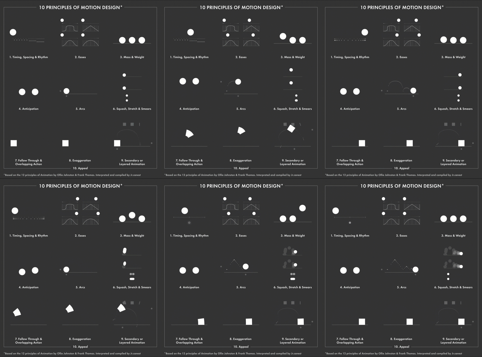
10 Principles of Motion Design by Jorge R. Canedo Estrada.
The most ambitious attempt to reorient motion principles around interactive UI elements (and their UX significance) is Issara Willenskomer’s UX in Motion Manifesto. Its depth is astounding, but it’s not light reading.
In establishing the 12 Principles of UX in Motion, Willenskomer:
- Distinguishes motion design from UI animation
- Articulates how motion aids usability
- Unpacks the inner workings of core motion behaviors
Motion Design and UX: Important Distinctions
Before addressing the principles of motion design, it’s important to highlight key distinctions that appear throughout Willenskomer’s manifesto.
Motion Is More Than Ornamentation
Motion design is not synonymous with UI animation. This is crucial because UI animation is almost always treated as a cosmetic afterthought with no bearing on UX (except to add charm). Motion isn’t ornamentation, it is behavior, and behaviors can only help or hinder the user experience.
Two Interaction Types: Real-time vs. Non-real-time
Motion design is concerned with two fundamental interactions: real-time and non-real-time.
- Real-time interactions provide immediate feedback when users manipulate UI elements on-screen. In other words, motion behaviors respond instantly to user input.
- Non-real-time interactions occur after user input, meaning that users must briefly pause and watch the resulting motion behavior before continuing.
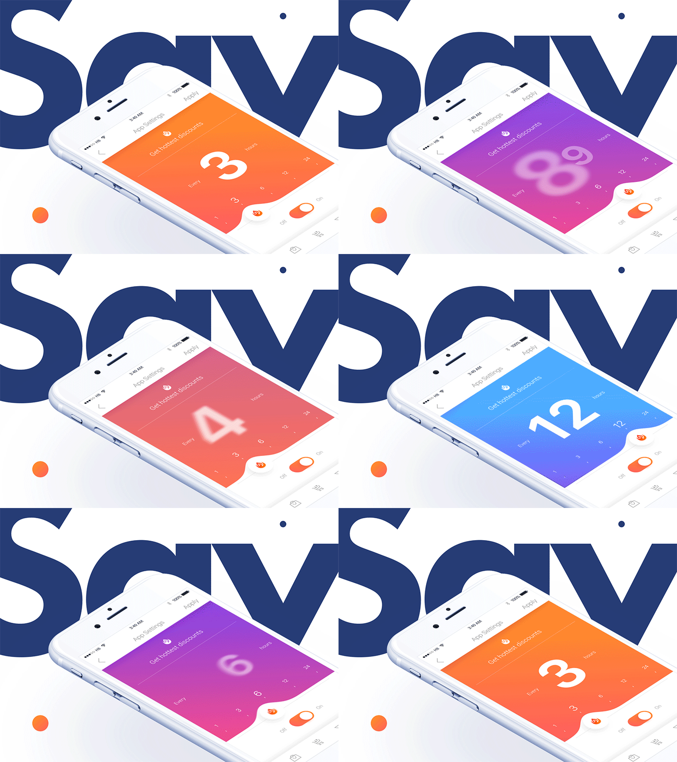
Real-time interactions: Motion behaviors immediately respond to user input. (Stan Yakusevich)

Non-real-time interactions: After interaction, users must briefly wait and watch motion behaviors. (Vitaly Rubtsov)
Motion Supports Usability
Motion design must support usability in four distinct ways.
- Expectation: When users interact with UI elements, what motion behaviors do they expect to see? Does motion meet the expectation or cause confusion?
- Continuity: Do interactions produce consistent motion behaviors throughout the user experience?
- Narrative: Are interactions and the motion behaviors they trigger tied to a logical progression of events that satisfies user intent?
- Relationship: How do the spatial, aesthetic, and hierarchical attributes of UI elements relate to each other and influence user decision-making? How does motion impact the various element relationships that exist?
12 Motion Design Principles for Digital Products
1. Easing
Easing mimics the way real-world objects accelerate and slow down over time. It applies to all UI elements exhibiting motion.
The opposite of easing is linear motion. UI elements displaying linear motion go from stationary to full-speed, and full-speed to stationary, instantaneously. Such behavior exists nowhere in the physical world and appears halting to users.

The UI cards and corresponding chairs move quickly, but they come to smooth and controlled stops thanks to easing. (Saptarshi Prakash)
2. Offset and Delay
When several UI elements move at the same time and speed, users tend to group them together and overlook the possibility that each element may have its own functionality.
Offset and delay creates hierarchy between UI elements that are moving at the same time and communicates that they are related, yet distinct. Instead of complete synchronization, the timing, speed, and spacing of elements are staggered, resulting in a subtle “one after another” effect.
As users journey between screens, offset and delay signals that multiple interaction options exist.

This cryptocurrency app introduces several UI elements at once. Their arrival is slightly staggered to inform users that the elements are related, yet distinct. (Gapsy Studio)
3. Parenting
Parenting links the properties of one UI element to the properties of others. When a property in the parent element changes, the linked properties of child elements also change. All element properties may be linked to each other.
For instance, the position of a parent element can be tied to the scale of a child element. When the parent element moves, the child element increases or decreases in size.
Parenting creates relationships between UI elements, establishes hierarchy, and allows multiple elements to communicate with users at once. For this reason, parenting is most impactful when used in real-time interactions.
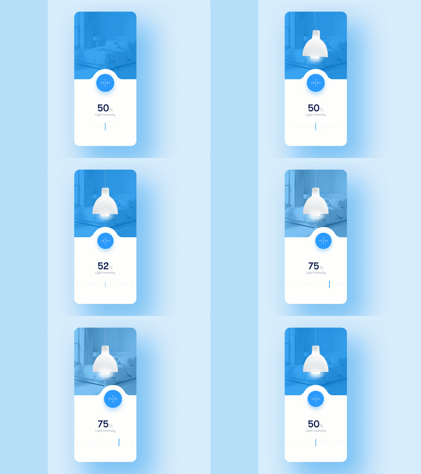
Here, the blue slider’s position controls the opacity of the background mask, the spread of the glow effect around the lightbulb, and the numerical value of the light intensity scale. (Ayoub Kada)
4. Transformation
Transformation occurs when one UI element turns into another. For example, a download button transforms into a progress bar, which transforms into a completion icon.
From a UX perspective, transformation is an effective way to show users their status in relation to a goal (Visibility of System Status). This is especially helpful when the progression between UI elements is linked to a process with a start and a finish (e.g., downloading a file).

Transformation signals the start, middle, and completion of a download. (Aaron Iker)
5. Value Change
Representations of value (numerical, text-based, or graphic) are abundant in digital interfaces, appearing in products ranging from banking apps to personal calendars to eCommerce sites. Because these representations are tied to datasets that exist in actuality, they are subject to change.
Value change communicates the dynamic nature of data representations and informs users that data is interactive and may be influenced to some extent. When values are introduced without motion, users’ willingness to engage with the data decreases.
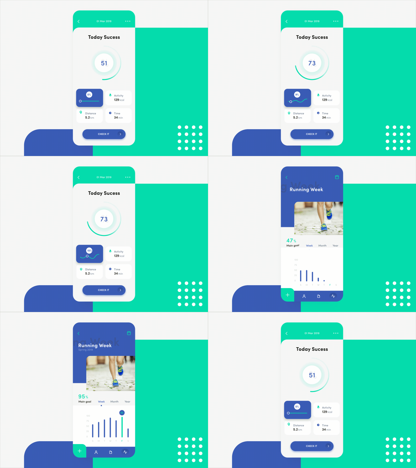
Values are introduced with motion to show users that they have the ability to impact the data. (Taras Migulko)
6. Masking
Masking is the strategic revealing and concealing of parts of a UI element. By altering the shape and scale of an element’s perimeter, masking signals a change in utility while allowing the element itself to remain identifiable. For this reason, detailed visuals like photographs and illustrations are ideal candidates.
From a usability perspective, designers can implement masking to show users that they are progressing through a series of interactions.

Masking is used to transition from image capture to upload to inclusion in an online storefront. (SELECTO)
7. Overlay
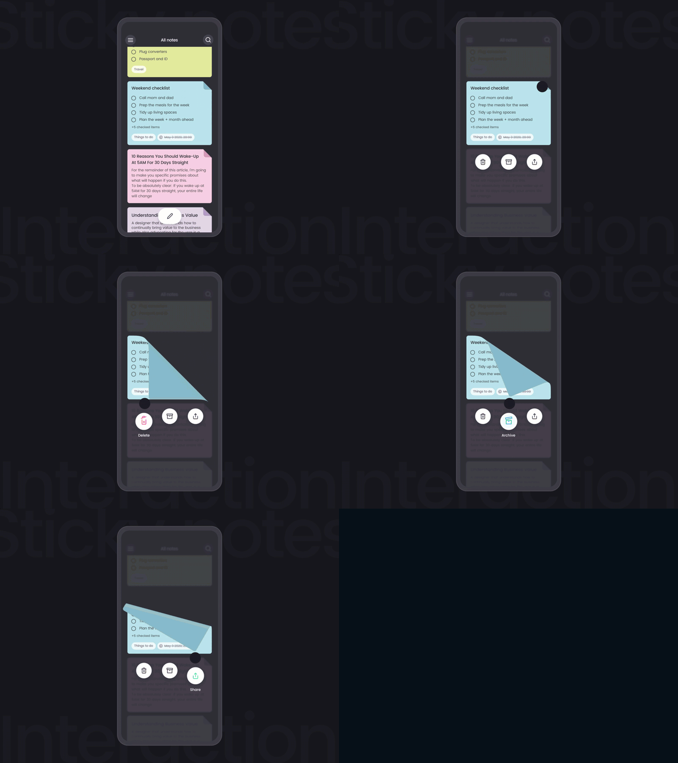
In 2D space, there is no depth, and UI elements may only move along the X or Y axis. Overlay creates the illusion of foreground/background distinction in the 2D space of UIs. By simulating depth, overlay allows elements to be hidden and revealed according to user needs.
Information hierarchy is an important consideration when employing overlay. For example, the first thing users should see in a note-taking app is a list of their notes. Then, overlay could be used to unveil secondary options for each message—like Delete or Archive.

Overlay allows users to quickly archive or delete entries in this notes app. (Karan Kapoor)
8. Cloning
Cloning is a motion behavior wherein one UI element splits off into others. It’s a clever way to highlight important information or interaction options.
When UI elements materialize within an interface, they need a clear point of origin that links to an element already on-screen. If elements simply burst or fade into existence out of nowhere, users lack the context needed for confident interactions.
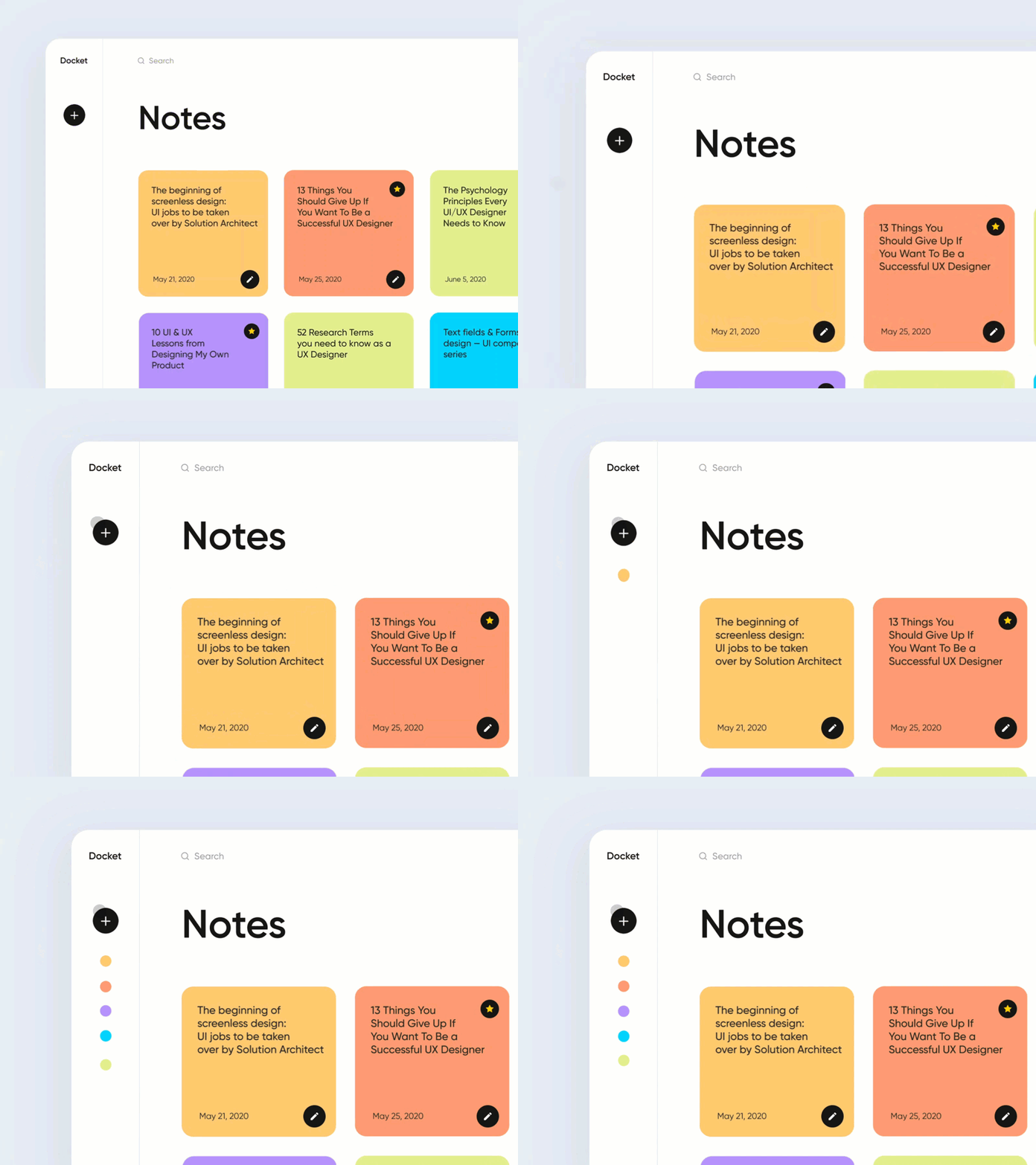
Users can click on the colored circles with confidence because they clearly originate from the “Add Notes” icon. (Ariuka)
9. Obscuration
Picture a frosted glass door. It requires interaction to open, but it’s possible to discern (to some extent) what awaits on the other side.
Obscuration works the same way. It presents users with an interface that calls for interaction while simultaneously revealing a hint of the screen to follow. Navigation menus, passcode screens, and folder/file windows are common examples.

Obscuration presents users with important interactions while allowing them to remain oriented within product narratives. (Kyle Abarquez)
10. Parallax
Parallax is displayed when two (or more) UI elements move at the same time but at different speeds. Here again, the intent is establishing hierarchy.
- Interactive elements move faster and appear in the foreground.
- Non-interactive elements move slower and recede to the background.
Parallax steers users toward interactive UI elements while allowing non-interactive elements to stay on-screen and preserve design unity.

With parallax, the most important interactive elements move the fastest, while non-interactive elements move slower and recede to the background. (Tubik)
11. Dimensionality
Dimensionality makes it seem as though UI elements have multiple interactive sides, just like objects in the physical world. The behavior is achieved by making elements appear as if they are foldable, flippable, floating, or bestowed with realistic depth properties.
As a narrative device, dimensionality implies that the different sides of a UI element are linked and makes for seamless screen transitions.
Dimensionality implies that 2D UI elements have multiple, interactive sides—just like objects in the physical world. (Sang Nguyen)
12. Dolly and Zoom
Dolly and zoom allow users to “travel” through UI elements spatially or increase their scale to reveal greater levels of detail.
- Dolly: Dolly occurs when the user’s point of view gets closer to (or further from) a UI element. Imagine a person with a camera walking up to a flower to get a closer shot.
- Zoom: With zoom, the user’s point of view and the UI element remain fixed, but the element increases (or decreases) in size within the user’s screen. Now imagine that the person stays put and uses the camera’s zoom feature to make the flower appear larger.
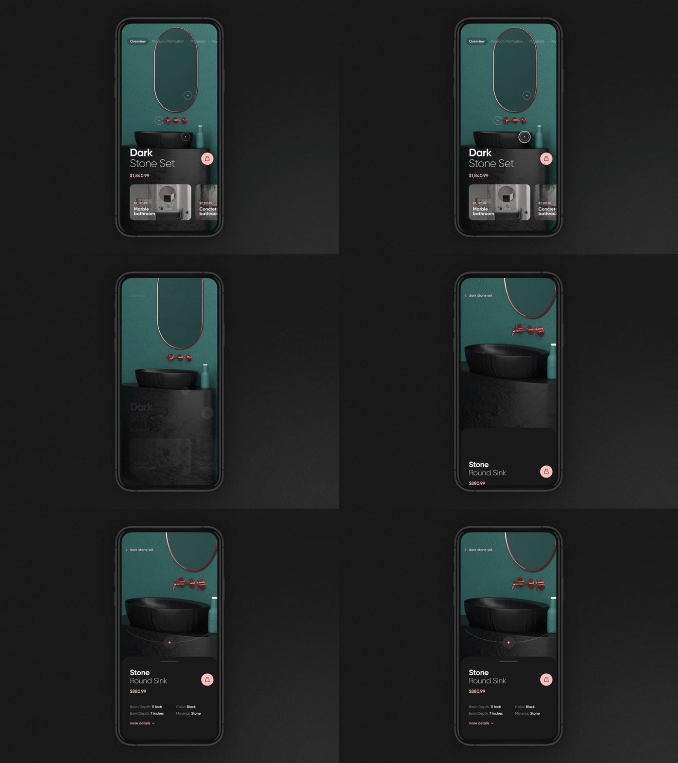
Dolly: The user’s point of view appears to get closer in proximity to the background image. (Yanosh)

Zoom: The user’s point of view doesn’t get closer to the image. Rather, the image’s scale increases. (Victor Aldabalde)
Motion Is Communication
Interactive experiences demand motion in all its spry and subtle forms. When the principles of motion design are upheld, even the most rudimentary UI elements become sophisticated agents of human communication. When the principles are ignored, movement embodies characteristics not found in the natural world. No amount of aesthetic splendor can overcome the resulting clumsiness.
The relationship between motion design and the UX of digital products is rapidly maturing. A principled approach to motion prevents undue reliance on the fleeting utility of trends, tools, and techniques. Better still, it spans the divide between the abstract motion of elements on 2D screens and the perception of movement in a 3D world.
Source: toptal


