Is Zoom a well-designed product?
Zoom has gained a lot of traction since the COVID19 pandemic. It is famously known for being one of the simplest and most reliable video conference applications. Therefore, I will assess Zoom Product Design (on 6 June 2020 version) in this article according to five key design principles:
1. Usefulness — Good usefulness means the product solves the issue it is tackling
2. Understandability — Good understandability means the product is easy to use and intuitive
3. Efficiency — Efficient product means it solves the problem efficiently
4. User Experience — Good user experience means the product delight the user
5. Communication with User — Good communication means the product provides necessary feedback to a user to avoid mistakes or confusion
Enjoy!
What is Zoom Video Conference?
Zoom Video Conference is an enterprise video conferencing platform. Its key differentiator from competitors is its ease-to-use, no login requirement, and easy installation for first-time users. Users can simply click on a link and join zoom via a link without even registering to the platform. There are also multiple features within Zoom such as virtual background, waiting room, and seamless cross-device operation that are very useful. In a nutshell, Zoom Video Conference is like Webex but without all the complexity. The target users are individuals across all ages for its free version and corporate for its paid version with additional features such as encryption, bigger meeting capacity with no limit on call durations.
Despite Zoom’s strong design, there are also areas of opportunities, especially for corporate/paid users. I will focus on five key design principles mentioned above to assess Zoom’s design quality.
Zoom Strong Design Choices
1. Usefulness
Zoom Video Conferencing works well. It reliably provides users with video conferencing feature without worrying that the connection or call quality will drop/unstable in the middle of the call. Its connectivity to other application such as Microsoft Outlook or iCal and seamless cross-platform integration also increase its usefulness. Users can schedule a Zoom meeting with one click from Microsoft Outlook or switch between mobile and desktop with a click of a button.
2. Understandability
Zoom is easy to understand and use. For example, users can join a meeting (without installation) in three simple steps: (1) Join a meeting, (2) Input meeting room number and password (if any), and then (3) Input your name. Most users understand how to navigate Zoom application with minimum ambiguity.

3. Efficiency
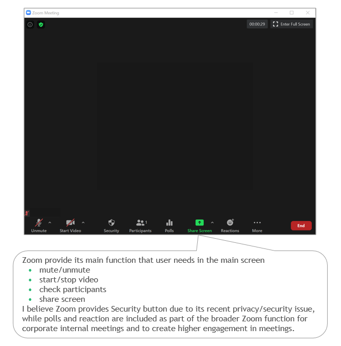
Zoom’s strongest design choice is its efficiency. While it takes multiple steps/accounts to join other video conferencing platform, Zoom requires only a meeting room number to join a video conferencing call. Additionally, the Personal Meeting Room feature also makes it easy for existing users to start a meeting (1-click only). Its simple 4-button design on the main screen also helps users efficiently choose the action that they want.

4. User Experience
Zoom Video Conferencing user experience delight users as the main video conference screen is not cluttered with too many functions. Zoom consciously decided to embed its additional features within its Settings function and leave only essential functions on the main screen. This is an important design choice that delights users. Furthermore, Zoom has consistent User Experience across different devices, from mobile, desktop, and web.
5. Communication
Zoom also provides users with necessary feedback, for example, a ringtone when a new participant joins a meeting allows existing members to realize they have new participants. Additionally, Zoom also provides a notification if it hears a voice coming from our device while we are being muted. Users often forget to unmute themselves before talking, and this notification solves the issue elegantly.

Zoom Design Opportunity
Although Zoom has made many good design choices, it still has some room of improvements:
1. Understandability & Usefulness — Share Screen function from Homepage
Share screen function on the home page is confusing for users. Users tend to want to join the meeting room first and identify other participants in the meeting room before they share the screen. This button in home page creates confusion and is not useful
Direct share screen function when joining a meeting is confusing and un-needed

2. Usefulness & User Experience — Inability to screen share iPhone/iPad from Desktop application
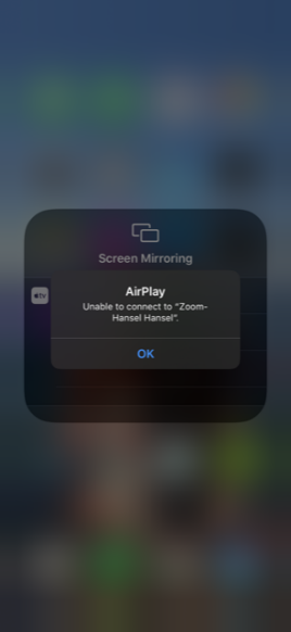
Zoom built a function for users to share their iPhone/iPad phone screen through desktop. The feature is activated using a screen mirroring feature on iPhone/iPad. Unfortunately, the feature is not working.
How is Zoom compared to competitors?
Zoom is not alone in Video Conference application industry. There are competitors such as Google Hangout or Webex from Cisco. Zoom has advantages and disadvantages in their product design choices.
Zoom’s main advantage compared to Google Hangout and Cisco Webex are its efficiency. Google Hangout and Cisco Webex require users to have their application installed to use their service. Additionally, Google Hangout require all participants to use Gmail account to join the meeting.
Zoom’s plethora of features also increases its usefulness/use-cases compared to competitors. For example, Zoom developed built-in chat, whiteboard, polls, virtual background, recording, waiting room, and room breakout capabilities, among many others. Both Google Hangout and Cisco Webex offer some of these capabilities but not in its entirety. Google Hangout only provides chat capability. Although Cisco Webex provides capabilities like polls and recording, it does not allow participants to be in a waiting room or room breakout capabilities.
Zoom’s advantage on usefulness also becomes its disadvantage on efficiency. Google Hangout users’ learning curve is lower due to its simplicity in function. Once a user joined a call, they know they can mute, project video, or end the call (3 buttons only). All of them are at the bottom of the screen.
In summary, Zoom Video Conference has really strong product design across the key principles with rooms for improvement on screen sharing function in homepage understandability & usefulness and to fix screen mirroring function phone mobile application. However, it needs to be careful about adding more features as it potentially makes Zoom lose its best-in-class design on usefulness and understandability while maintaining good efficiency for users. I would prioritize the second opportunity for business users as fixing this feature will add more use-cases for customers/users, whereas the first opportunity will result in a low usage feature.
Source: medium
